A fresh new look for Pacific provider Vaka Tautua
Vaka Tautua, a national ‘by Pacific, for Pacific’ organisation, has revamped its brand identity, launching a new logo and a redesigned website. Under new leadership since May and looking to the future, the time was ripe for the organisation to undergo a brand refresh.
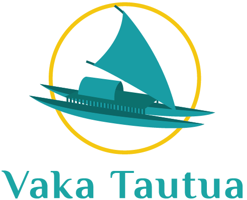
The double-hulled vaka in the updated logo pays tribute to the ancient vessels that carried our Polynesian ancestors across the vast Te Moana Nui o Kiva, populating island nations and eventually bringing the first peoples to the shores of Aotearoa.
The ocean-going craft depicted has hulls of equal size, with one representing Vaka Tautua the organisation and the other the community it serves, journeying side by side. The large sail is fully unfurled and catching the wind, representing speed and agility.
A large central platform joins the two hulls – this traditionally brought stability and provided space for housing families and carrying the resources to sustain them. The structure is symbolic of the support Vaka Tautua endeavours to provide Pacific peoples, to ensure they can thrive.
Inspired by Epeli Hau’ofa’s essay ‘Our Sea of Islands’, the ocean blues symbolise how Pacific peoples are all connected as a collective linked by the sea. The vibrant gold colour of the sun inspires, uplifts, and symbolises success. The brand patterns were influenced by Samoan and Tuvaluan designs, intended to represent weaving the Pacific collective together.
Vaka Tautua’s new brand identity is a fresh start for the organisation, a visual indicator of its continued commitment to Pacific peoples and its partnerships. Guided by the community and navigating alongside service users, Vaka Tautua is on a journey of transformation, reflecting new and exciting changes in the wider health and social services sectors in Aotearoa New Zealand.

